Tampilkan postingan dengan label Sector Rotation Trading. Tampilkan semua postingan

Minggu, 23 Juni 2013

Personal Finance (12): Guru Rotation in the Financial Market

There are many famous Gurus in the financial market, and their philosophies are pretty well accepted by their followers (subscribers).

Take for examples:
1. Jim Rogers is the icon represents long term investment in the commodities market.


2
2. Marc Faber, also known as Dr. Doom, advocates that the market is collapsing, collapsing, and collapsing...


3.
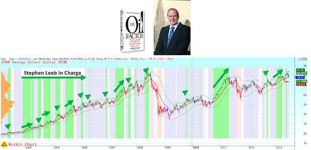
3. Stephen Leeb is using the "Peak Oil" as a backgroud and focus on Energy Sector.


4.
4.  Peter Schiff is singing about the collapsing US Dollar and Accumulates physical gold or GLD (ETFs).


.
And, when they are correct, they will occupy everywhere in the media and get more followers.

Now... As shown in the charts, they were ALL CORRECT at certain point of time in a "Rotational Manner".

So...  Don't you think that having a "market neutral mentality", doing your study, understand and follow the market actions with the charts, and perform asset class rotation is a better deal?


Now...
See what the successful Trader and Trainer in the Stock Market, Richard D. Wyckoff, had to say:


Very true!  In my view, most of the publication on financial advices and news are just like Coke or  genetic modified foods.  They are are produced for the public consumption with the intention of making a profits out of it.  The earlier one chooses to stop taking them, the earlier he gets healthier.


"What information consumes is rather obvious:
it consumes the attention of the recipents. 
Hence a wealth of information creates
a poverty of attention." 
- Herbert Simon 


<Go to Home>

Sabtu, 08 September 2012

Project Freedom (8): Follow the Money


Follow The Money: When China Stimulates its Economy, Buy Coal!

When the world economy was running into trouble since the beginning of 2008, China announced the 4000Billion RMB Project (四万亿计划) on the 18 Nov 2008. Soon after that, the economy turned around, though it did not last for very long...


Figure 1: The Correlation between FXI and KOL
The above illustration shows the XinHua China 25 index, the Global Coal ETF Charts, and their correlation.
As China is the world Largest Coal Consumer, when they stimulate their economy they need more energy for their power plants, more material to built infrastructures and consumer products, therefore the demand for coal would increase.


Figure 2: One year after the China Economy Stimulation Plan

 
The above chart shows the Result a year after the stimulation.  Though the XinHua China 25 index rose for 85%, there were many other sectors/countries performed much better than that.
 
The Top Ranking was KOL (Global Coal ETF), follow by Metal, China Real Estate and other related material producing countries.

YES…   These are History.
Is there anything that we can learn from it???


Figure 3:  China market bound on 7 Sep 2012 with new stimulation plan
 

Of course!!! 
 
Now…  Let’s look at these news:

  (The analyst from China said that the government will invest more than 1000 Billion RMB to strengthen their infrastruture to simulate the economy)

2.  万亿项目获批股市一阳指  
   (China market bounds up on the news on new stimulation plan approval)

3.  China approves US$158b in infrastructure

Yes.  The history will repeat itself to high degree (provided there is no major war and natural disaster).


Notes:
1)   This is similar worldwide...  It follows the Pareto Principle, since the recorded history, that 80% of the wealth belongs to the 20% of the people (these numbers are just getting bigger in spread - 90% vs 10% or worst).   The more money the governments pour into their economy would only benefits to the minority who know how to get it.   Normal working class would normally working harder to keep their job, and therefore miss the opportunities and suffer from the aftermath through inflation.


2)   Even though the world economy is in deep trouble, and it will reveal the trouble later at a bigger scale when there is not way to cover up.  But, at the moment, these stimulus could help to prolong the grow before the final collapse.  Just like giving another heavy dose of drug to keep the already exhausted sport man to continue the game...  

Therefore, timing it with charting for proper entries and exits to ride the trend is important, never argue with the mass psychology that forms Mr. Market with logic using the conscious mind.


"A speculator must concern himself with making money out
of the market and not with insisting that the tape must
agree with him.  Never argue with it or ask for
reasons or explanations."
- Jesse Livermore


<Home>

Selasa, 17 Juli 2012

Project Freedom (7): The Galaxy Chart

Good day,

This article is a continuation of the previous entry of the blog...

----------8<    (Cut and paste from Wikipediaon Dow Theory     >8------------
The Dow Theory on stock price movement is a form of technical analysis that includes some aspects of sector rotation. 
------------------------------------------- 8<--------------------------------------------

As one can see from the above statement that the idea of Sector Rotation had been officially around for at least a century,  but, if one were to flip through the whole library of Technical Analysis books in the library, he may not find more than 3% of the books mention about it(been there, done that).  And, even if one can find such topic in the book, most of them merely touching the surface by introducing that there is such thing around.
Personally, I think that the traditional way of analyzing the price chart is hard to VISUALIZE how these rotation take place.   Here is to introduce a tool that could facilitate the user to visualize and understand how the Rotational of the stocks/sectors are taking place in the market.    Thanks for the exponential grow of personal computer's speed over the years and these CPU intensive tasks can be handled with ease nowadays. :-)

(1)  Transformation of Traditional Chart into a X-Y Cartesian Plane.
Figure 1: Transformation of Traditional Chart into a X-Y Cartesian Plane.
Figure 1 shows how a normal chart can be transformed into The Galaxy Chart in showing the Relative Momentum and Trend of multiple stocks.   Though the human eyes can ONLY see the 2-dimensional chart, it is up to the programmers' IMAGINATION to incorporate N-dimensional information into it.  For instance, add a filter to get rid of those stocks that are moving side way.


(2) Understanding the meaning of The Galaxy Chart

Figure 2.  The Galaxy Chart


Figure 2 shows a typical Galaxy Chart.   Every stock is represented with a comet-like diagram with multiple dots in its tail.  The POSITION of the biggest dot in the comet represent the last bar's RELATIVE STRENGTH  of the momentum and trend with respect to others stock in a same watch list.  The length of the comet tail can be set by the user, and each additional dot appears on the tail mean an additional look-back period.  Therefore, the DIRECTION and LENGTH between the dots show the change of strength in Momentum and Trend dynamically over time.   So, it provides more information than a normal static list of stock scan from explorer as it shows the dynamic trail.


Figure 3. Zooming-in to the Upper Right Corner where both Momentum and Trend are both Postive.


Figure 4. Statiscal and Probability wise...


.
Figure 4 is to illustrate how to focus on the fastest moving stocks visually.  Note that there is a criss- cross with grid lines in the center of the chart, which represent the (0,0) origin position of the X-Y co-ordinate.  The upper half of the chart represent the +ve momentum and lower half of the chart represent -ve momentum.  While the right hand side of the chart represent the +ve trend, and the left hand side represent the -ve trend.

Therefore, the top right corner of the chart can only be populated with stocks that are both +ve in momentum and trend.  The further away from the center are the faster the runner, and they are not range-bound.  While the bottom left corner is just exactly opposite.  (Note that the distribution chart in the figure is for illustration purpose ONLY, it does not mean that the stocks in the market have normal distribution in +/- profits over time.)


Video 1.  Play back of Rotational Movement


The above video shows the SPY and its 9 sector ETFs on how Rotation in the sectors take place over time. 

(3) Set up
Figure 5. An example on dual monitors intra-day set up


This is user preference... 
It can be in various time frame.  Start from Intra-day to Monthly.

(4) Caution!
Although any programmer with graphic programming experience can build up this platform within a week or so...
And: 
(a) Knowing to use the right alogrithms to feed in the X-Y co-ordinate is the key. GIGO(garbage in garbage out)!
(b) The sector rotation concept is simply another form of Trend Trading.  Therefore, it inherited a drawback from the Trend Trading Methodology.  That is the deep drawndown during the change of trend, where the fastest stocks could fall the fastest and weakest stock rebound the fastest.   Therefore, a very STRONG filtering technology MUST be built-in to the system to prevent such thing to happen during such period -> take the profits or cut losses quick.  Such as Vibration Energy Filter or any equivalent... Then it can be considered as a complete system.

(5) Conclusion
The last few articles are shared not because the author/programmer, I AM, do not understand nor under estimate their value and shared them accidentally.  Rather, they are shared because I strongly believe that when these concepts is fan out openly...  it may be duplicated to a certain degree that could help the general public to equip themselves with a better understanding and tools to handle the market.


Just to side track with a small story that happened in my kid's science class not long ago...
The teacher in the class asked the students that "What If Thomas Edison did not invent the light bulb?"  Then looking for the standard answer: "Oh!  We are still having to light the candle at night!"
"NO! NO! NO!" I told her... 
"If Thomas Edison did not invent the light bulb.  Someone else would have invented it just slightly later.  Or, if someone else did not invented the light bulb, daddy - me could have invented the light bulb.  And, if I don't invented the light bulb, you may have the chance to invent the light bulb yourself!"   Then I had to add, "Now you know the real answer, BUT, in the school test or exam, you MUST use your teacher's answer."
The morale of telling this story is that...  If one don't share it, someone else down the road would share it anyway. 


Happy reading.
KH Tang


Senin, 09 Juli 2012

Project Freedom (6): Back to Basics

About 5 years ago, I came across an old and experience trader in a forum...  In asking for advice, he said that "All you need to read and understand about trading is in a few classical theories already exist about a century ago: 
(1).  The market waves in Dow Theory, 
(2).  The Vibration Energy by WD Gann, and
(3).  The philosophy of riding the Leaders by Richard Wyckoff or Jesse Livermore.
All the modern books are more of repeating and re-phrasing what had been said."

That's very true.
And, I find that to add in another guru would be more complete:
(4).  The trading psychology aspect by Mark Douglas.

The following charts are used to illustrate the implementation for these gurus' theories.

(1).  On Dow Theory.
Dow Theory is the grandfather of all Technical Analysis.  It consists of a set of 12 "Basic Tenets" (ref: Technical Analysis of Stock Trends - Edwards & Magee).  
Over here, the follow charts just focus on the implementation on one of the Basic Tenets - "The Three Trends in the Market".

Here is the definition cut and paste from wikipedia on this particular tenet:
-----------------------------------------8<-----------------------------------
The market has three movements
(1) The "main movement", primary movement or major trend may last from less than a year to several years. It can be bullish or bearish. (2) The "medium swing", secondary reaction or intermediate reaction may last from ten days to three months and generally retraces from 33% to 66% of the primary price change since the previous medium swing or start of the main movement. (3) The "short swing" or minor movement (momentum)varies with opinion from hours to a month or more. The three movements may be simultaneous, for instance, a daily minor movement in a bearish secondary reaction in a bullish primary movement.
-----------------------------------------8<-----------------------------------
Now let see how to apply these theories on the following chart.  This is China Shanghai Stock Exchange Index.


On the following diagram, when Zoom in, it can see that there are three indicators below the price chart.  Which are (1.) Momentum, (2.) Medium Swing, and (3) Trend.  These are corresponding to the 3 movements (waves) in the market.

At any one time, these 3 three indicators may run into different direction (up or down), and when the 3 movement are in sync into one direction (either up or down), then usually there will be significant movement on the price.
As shown in the price chart area, it is labeled with green when color when all the three movements are up.  Red when all the three movements are down.  And, yellow when there are moving in different direction - usually at the stage of consolidation or pull back.

If one were to use some kind of multiple moving averages such as, 25,100, 200 to determine buy or sell, then he is also using this theory.  Just that normal MA, EMA are having too much lag that will not produce good result.  It got to be dynamically mapped. (Inspired from reading "Holophany - a New Philosophy and Logic" by Clara Szalai.)

The Multiple-Time-Frame concept using daily and weekly chart is another form of waves analysis.
The JM Hurst Cycle Analysis aims to find the synchronization of shorter cycles within longer cycles is also another form of wave analysis.

Their COMMON goal of these analysesis to LONG when all the waves are moving in the up direction while SHORT when all the waves are moving in the down direction.


(2). On Vibration Energy.
The Law of Vibration in the stock market was introduced by W.D. Gann.  Gann's work is hard to understand as it involves astrology, ancient geometry and mathematics.  But, nevertheless, if one were to study and think about them long enough, he may get something out of it...  Just that if a group of ten persons doing the same research, they might get twenty versions of the interpretation.   And, this is merely my personal interpretation...

If the stock is in its steady state of vibration towards up and down direction, it would has certain amount of vibration energy level pointing in the same direction.  If it is on the sideway, it is pretty much random and will cancel themselves.  Therefore an adaptive filter can designed to capture such energy.  As compare to the previous diagram, the price chart is now built-in a filter to detect the state of trend (up, sideway, and down trend).  Also just below the price chart, there is an Adaptive  Vibration Energy Indicator to indicate the worthwhile trend. 

Adding this filter to the Dow Theory would very much reduce the trading frequency as its goal is to eliminate trading when the stock in it consolidation state.


(3). On the Philosophy of Always Riding the Leading Sectors/Stocks
In reading Richard Wyckoff and Livermore books, one can find that they put emphasis on trading the leading stocks in the leading sectors.  This philosophy itself has the following important implication:

1)  Benchmarking the stocks with their Relative Strength.
In order to find the Relative Strength of a stock among all the other stocks in the market, the indicators used MUST NOT be range-bound to certain value.  For example, many popular indicators are swinging between a certain ranges, such as 0 to 100, -100 to 100, etc.   When one compare APPLE COMPUTER to bond market, these range-bound indicators can't differentiate which is stronger in relative sense. 

2) Rotational Trading.
In rotational trading philosophy, it recommends jump to the faster running horse when it find one (of course, one need to set the period of doing so, say one week or so...  And, very much depends on individual perference time-frame of operation.)

One simple way to achieve these two KEY POINTS is to insert a reference ticker inside the current monitoring stock indicator.  For example, in the following diagram, the Momentum, MediumSwing and Trend indicators are inserted with the SPY (S&P500) as reference ticker. 

Note that there are some circles highlighted in these indicators.  Without the reference, the indicators would have give green signals when they are above "Zero Line", and give red signals when it is below "Zero Line".  Now, with such reference line, they must be greater than both the reference strength and the zero line in order to generate a green signals...  Same idea applies to the downside.  Or it would just generate a yellow signal.

One can use this idea to find the stronger sectors in the market using SPY as reference strength, then find the stronger stocks using that particular sector as reference strength.


To further illustrate the point on Relative Strength Benchmarking....  Below is diagram showing the Strait Time Index (STI) and its 30 components. 
Most Benchmarking methodology is to compare the percent price movement over a period of time.  This could be useful most of the time.  BUT during the transition of changing trend, it would produce a great lag that is not acceptable.
Instead, one can compare their indicators strength in the same pane and rank it... It would definitely produce much timely result.

(4). The Trading Psychology
There are quite some materials on Trading Psychology in the market today.  Recommend to go through the material by Mark Douglas as they are very helpful.  Especially when he talks about the Probability and Edge.   Here has a snapshot:->
.
.
.
.
.
.
.
.
"Our most valuable possessions are those
which can be shared without lessening;
those which when shared multiply."
I DARE YOU - William H. Danforth


To be continue with  ->The Galaxy Chart.<-

Senin, 30 April 2012

Project Freedom (4): Understanding of the States of Market Trend and Rotational Trading Concept

Attached are a few charts aim to demonstrate the importance of understanding the State of Market Trend and the Rotational Trading Concept which could help one to handle his personal finance.

POINT I: Understanding of the States of Market Trend.

Fig 1.  ^STI Daily Chart (2 years)  (Click on the chart to Zoom in)

The above chart show a daily chart for ^STI from Apr 2010 to Apr 2012.  This particular period is selected to show that money put in the market (so call buy and hold investment) can ended up with zero percent return over years.
In the price chart, there are algorithms built-in to draw the trendlines (also act as dynamic support and resistance lines).  When the bar change color, it signal a possibility of change in trend. 
In the lowest pane, it is an indicator desgined specifically to measure the Vibrational Energy of the stock:
If the Energy is High and moving upwards, it signals a state of UPTREND MARKET.
If the Energy is High and moving downwards, it signals a state of DOWNTREND MARKET.
If the Energy is Low, it signal a state of SIDE WAY MARKET.
It also display the number of bars in the respective state of trend and its percentage over the period.  For example:

Over the two years period, when breakdown into percentage...
The UPTREND is      : 31.39%;
The DOWNTEND is : 18.05%;
The SIDE WAY is     : 50.56%.

Fig.2 ^STI Daily Chart (1997 Jan - 2012 Apr)
So, one may think that two years of data could be too short to make the point.  How about longer period of data? 

So, with the longer term of data, it show that the result is similar with the previous finding. And, lead to some basic understanding of the market trends structure...

Conclusions from Point I:
1) The Speed of UPTREND is SLOWER and DOWNTREND is FASTER.
2) BUY AND HOLD strategy is NOT WORKING in todays market.
3) One must be able to ride on the Trend in order to make profits from the market.

POINT II: Understanding of the Sector Rotational Trading Concept.

As the previous point illustrate that money put in one market/Stock/Fund are really productive about 30% of the time in UPTREND, 20% in DOWNTREND, and wasting time 50% of the time.
So, if one were to only LONG the market, does that mean 70% of the time he must wait???
Not true if he understand the concept of Sector Rational Trading.


Fig 3. State of Trends in S&P500(SPY)
and its 9 sectors(XLB,XLE,XLF,XLI,XLK,XLP,XLV,XLU,XLY) (Apr 2010 to Apr 2012)


See... 
The money in the market are of fix amount.  When the stock market is moving up strongly, people would pull money out of bond market and put into stocks and cause bond market to fall, and vice versa.  Similarly, the professionals would not put their funds in equal distribution into all sectors, they would pull the money out from the weak sectors to put them into the strong sectors.  And the sectors Relative Strength would keep changing over time.  In the picture, you can see the TREND is Out Of Phase from one another.

With the same token, one can then zoom into the individual stocks, in the strongest sector, to ride on the trend with the few strongest stocks

By the way, you may be interested to zoom into the chart and see the respective percentage of trends in various sectors.


Conclusions from Piont II:
1)  It illustrates a VERY IMPORTANT POINT that is IN CONTRADICTION with one of the popluar myth in the investment industry -->  That is DIVERSIFICATION the money into many sectors in equal portions as to reduce RISK.  As sectors trend pretty much follows the market (after all they are the components that create the market).

2)  In order to maximize the profit from the market and reduce risk.  One must always rotate money into the strongest few sectors when there is a trend.

---------------------------------------------------------------------------------------------------------------------
I found a picture on the web and it is Very True. 


There are certain risks in life one can simply choose to avoid it, such as if one don't know how to swim and he choose not to go near the sea... He may miss some fun for that but find more fun somewhere else.

On the other hand, there are some risks one cannot avoid, such as financial crisis... Then, the only logical answer in dealing with it is to master it. 
And,


if it is necessary...  Then, it doesn't matter how much time it may take.
Whether it may require 3 years, 6 years, 10 years or more,
something learnt is something gained. 

Time is ticking anyway regardless whatever nice phrases one may come out with. Such as:
"Only IF I have the time..."

With the current state of economy, which is full of potential for turbulences such as:
* Debts in certain countries in EuroZone building up,
* Energy Crisis due to Peak Oil,
* Over Population on earth,
* Aging of the Babyboomer in USA (in fact it is a worldwide problem, and more serious would be in China for its one child policy), and
* Increase in trend on Unethical issues exposed from corporation executives (worldwide)... etc.
I cautious myself not to be negative, but logically, it can only predict more financial crisis in local and global scale to continue happen in the near future...

So.  It is my simple idea that when more people willing to learn about it, then it would make market manipulation task more difficult for the minority and BALANCE IT.  Let's make it so! :-)


Bless You
KH Tang


A more throughout explaination on Sector Roation -> Back to Basics & The Galaxy Chart.